Prompt
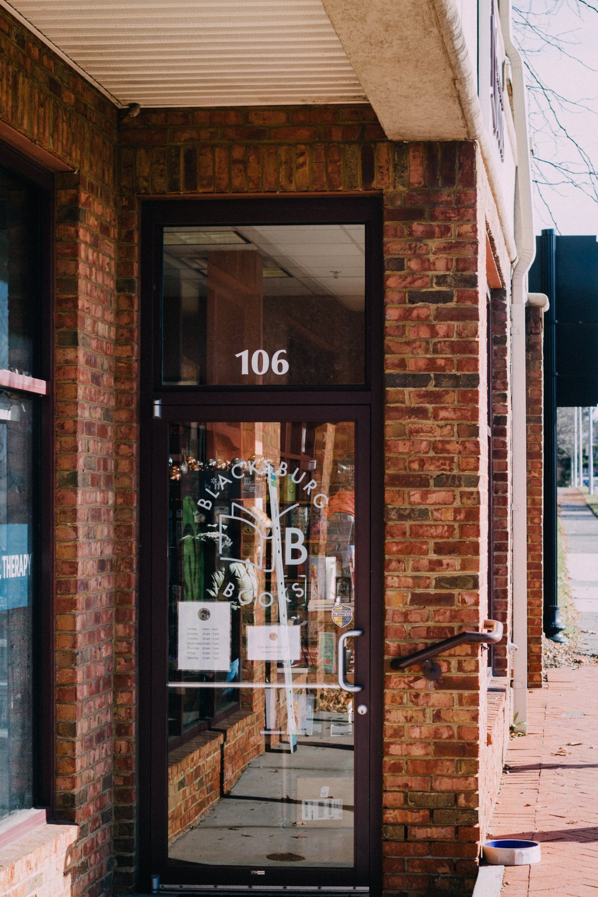
The owners of Blacksburg Books came to me for a logo for their new store. As a prospective new downtown Blacksburg business, they had a budget for this project which was just slightly below my standard logo price. Since my project prices are based on an approximate hourly rate, I was more than happy to negotiate. This model is a win for both of us because it means that my clients get what they need now for what they can afford right now, which enables them to grow. Later on down the road, if they want to make updates, they know they can come to me for a fair hourly or project rate again.
Process
Before we got started, we took into account their ideal turn-around time. All creative processes have some unpredictable factors that can't be foreseen, but it's important to have goals set which both parties can agree to meet.
Research
An important first step for both parties is the research stage. I ask every client to search on Google and social media for stuff they like. (Sometimes this may also include notes on what the client doesn't like.) I ask them to look both at art relevant to their industry, of course, but I also ask them to take the initiative to examine details of logo design in general.
In this case the client came with inspiration and a design idea, so we were able to narrow it down quickly.
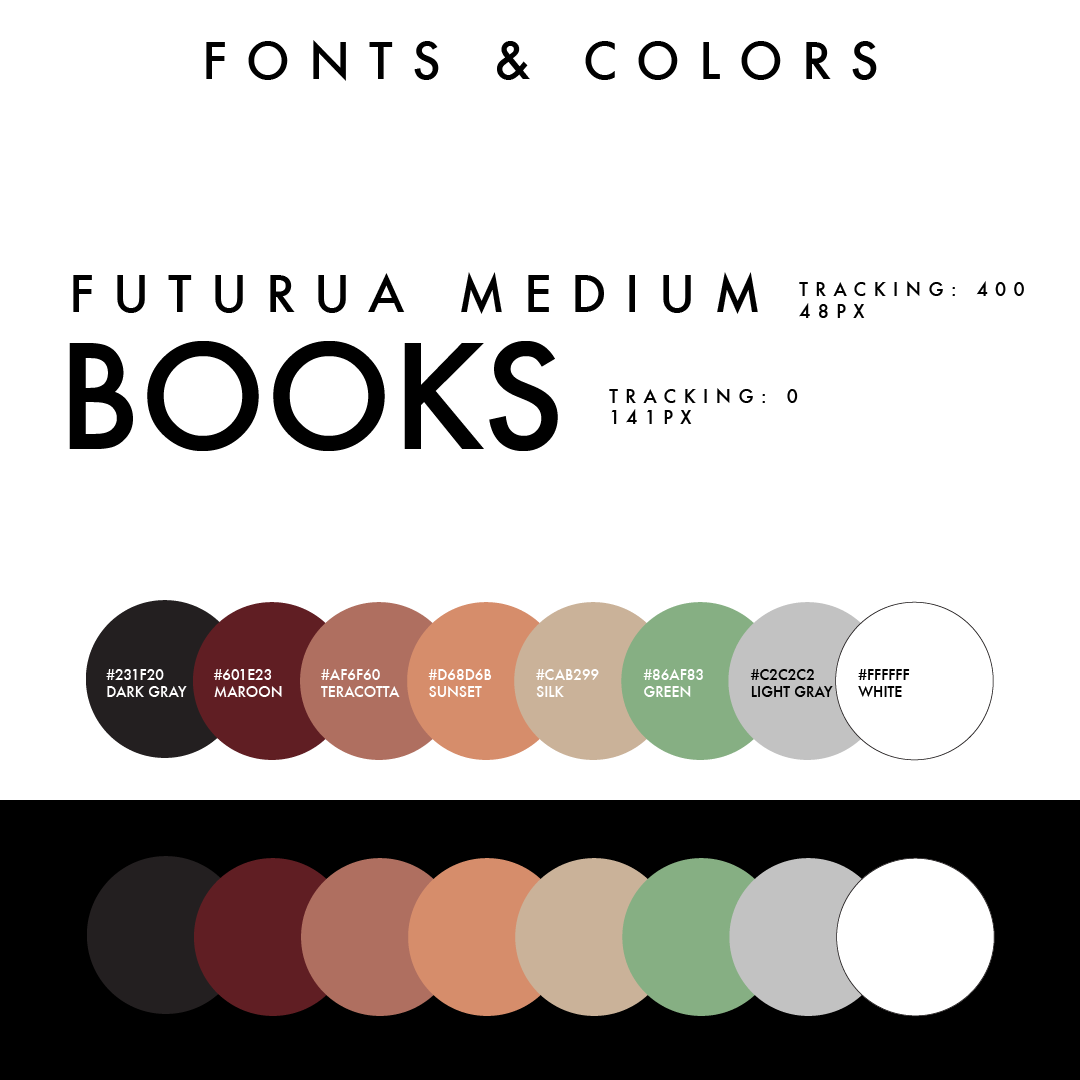
Fonts & Colors
One of the next important steps is choosing fonts and colors. We wanted simple and elegant, and we tried out a multitude of both serif and sans-serif options before we narrowed it down to a modern sans-serif font.
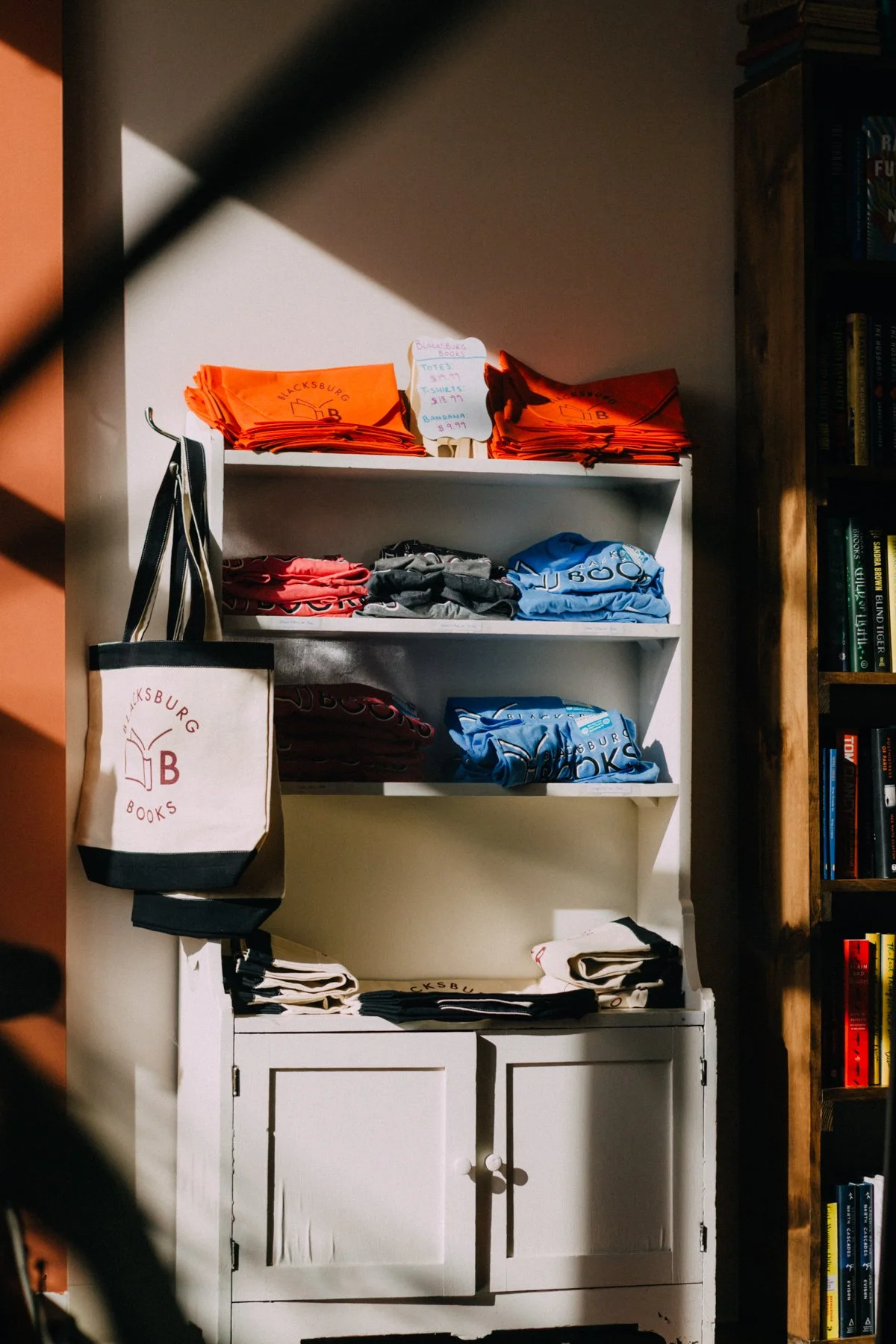
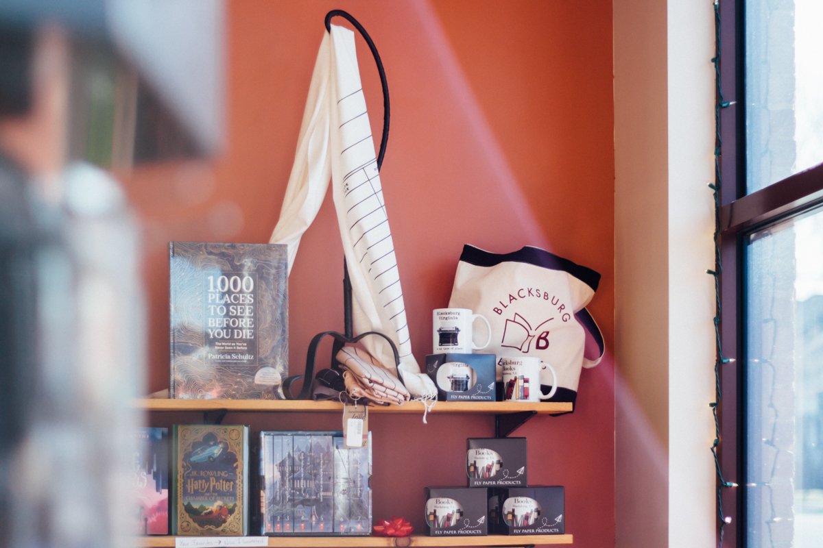
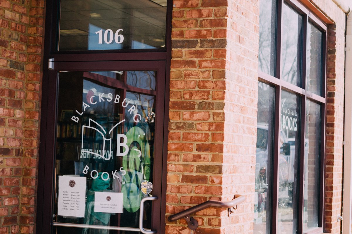
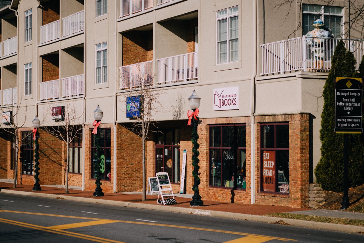
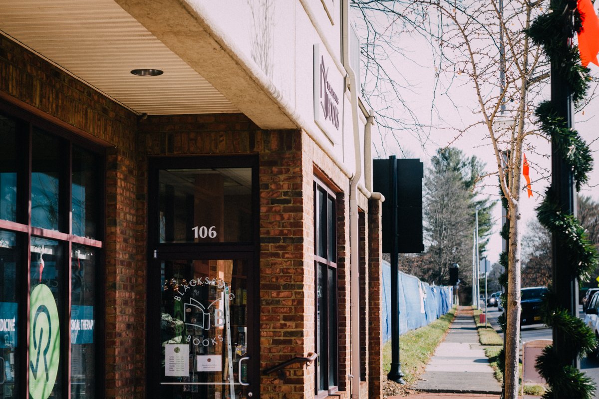
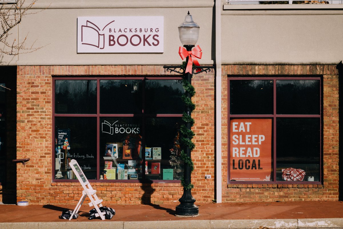
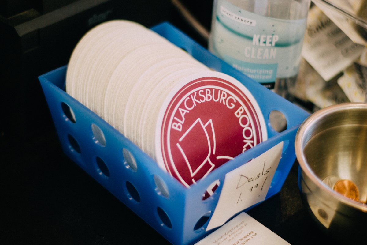
For the colors, we wanted something that somewhat compliments the Virginia Tech colors without being orange and maroon. The colors were also inspired by the colors of old books — usually dark reds, greens, blues, teals. For the inside of the store, the client picked some terra-cotta colors for paint and we were all drawn to the maroon/burgundy tones.
After exploring both cool and warm vintage-esque palettes, we settled on a palette of primarily the maroon and terracotta colors with white as the contrast color. For an accent I included a light, sage green. To compliment these main colors I also included neutral beige and gray.


Brands Build To Last
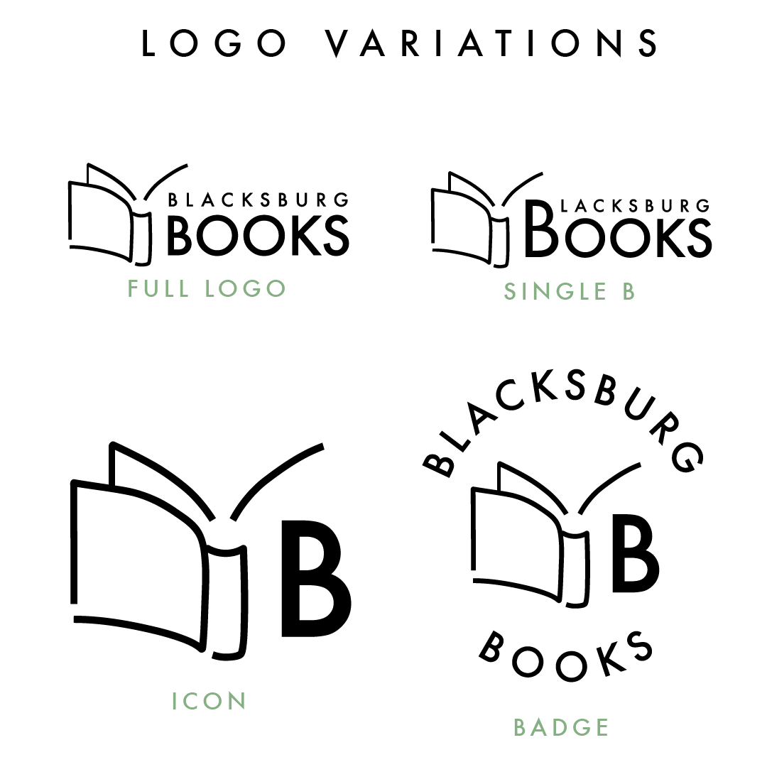
I exported plenty of logo variations in every available brand color and provided them with vector files.
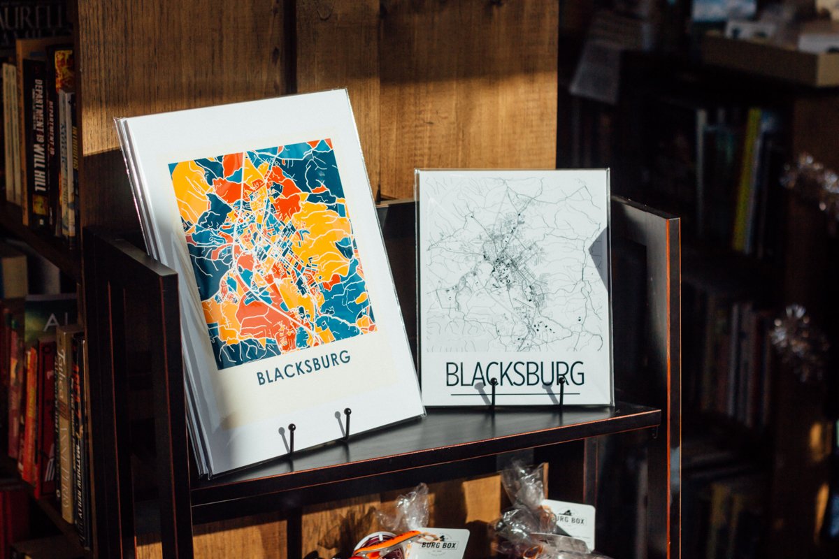
With time to spare, I was able to include a short and sweet in-person Canva tutorial as part of our final project consult so that the business' owners could put their logo to great use right away. We discussed some brand use best-practices such as using the same fonts across all mediums to add cohesiveness to the brand. They set up their website themselves and manage their own socials — it all looks fantastic!
Reflections
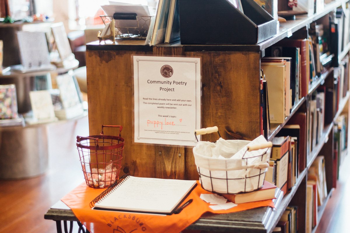
When we started this project I asked the client what motivated them to open their business — what their values are, what sets them apart. The answer was more or less COMMUNITY:
“The Blacksburg community guides us in everything we do. The primary source of books and inspiration is a special relationship between neighbors, and we want to honor that.
We also want to keep things as local as possible - not just the donated books, but also any other items we sell and - importantly - any events we might have either formally or informally. Ideally the bookstore would function as a community space where people can meet, learn, run into friends, and linger over a good book.”
I add this quote from Ellen & Laurie a few months after the original publishing of this post because I believe they've absolutely already achieved this vision. I'm proud that my humble logo design represents such an unstoppable force in the Blacksburg community, and I can't wait to see what they do next!