Expectations
Project Start: July 2, 2021
Brandy Renee McCann (Appalbrandy.com) reached out to us to replace her Wordpress site with something better.
She came prepared with some examples of other writers’ sites that she liked.
One of the main goals (besides typical things such as a general design upgrade and improvements to SEO) was to find a way to better showcase and organize the scope of Brandy’s writing work.
Process & Results
We started with a quick consultation to go over the pros/cons of switching from Wordpress to Squarespace and address the client’s questions and concerns. Then, the client emailed over a document outlining all the pages she wanted and the content she wanted included.
Template Choices
I use a variety of charts that break down Squarespace’s template features to narrow down choices based on the client’s needs. I offered her several choices of templates to choose from. Through a process of elimination, we settled on one.
Content
I then began the dirty work of systematically copying and pasting the content over from her old site to the new one. I also merged new site content at this time.
Throughout this especially busy part of the process, I keep clients updated with almost everything I’m doing — I itemize tasks that I’m working on or have completed, often with the opportunity for the client to make a choice or an invitation for feedback.
We used multiple blog pages to keep distinct categories of her work separate. Within each blog there are categories and tags to organize different subject matter.
Quick Logo Design
Because of how straightforward most of this process was, I was also able to include a simple logo design into my time budget for this project to establish a brand identity and create visual unity on-site.
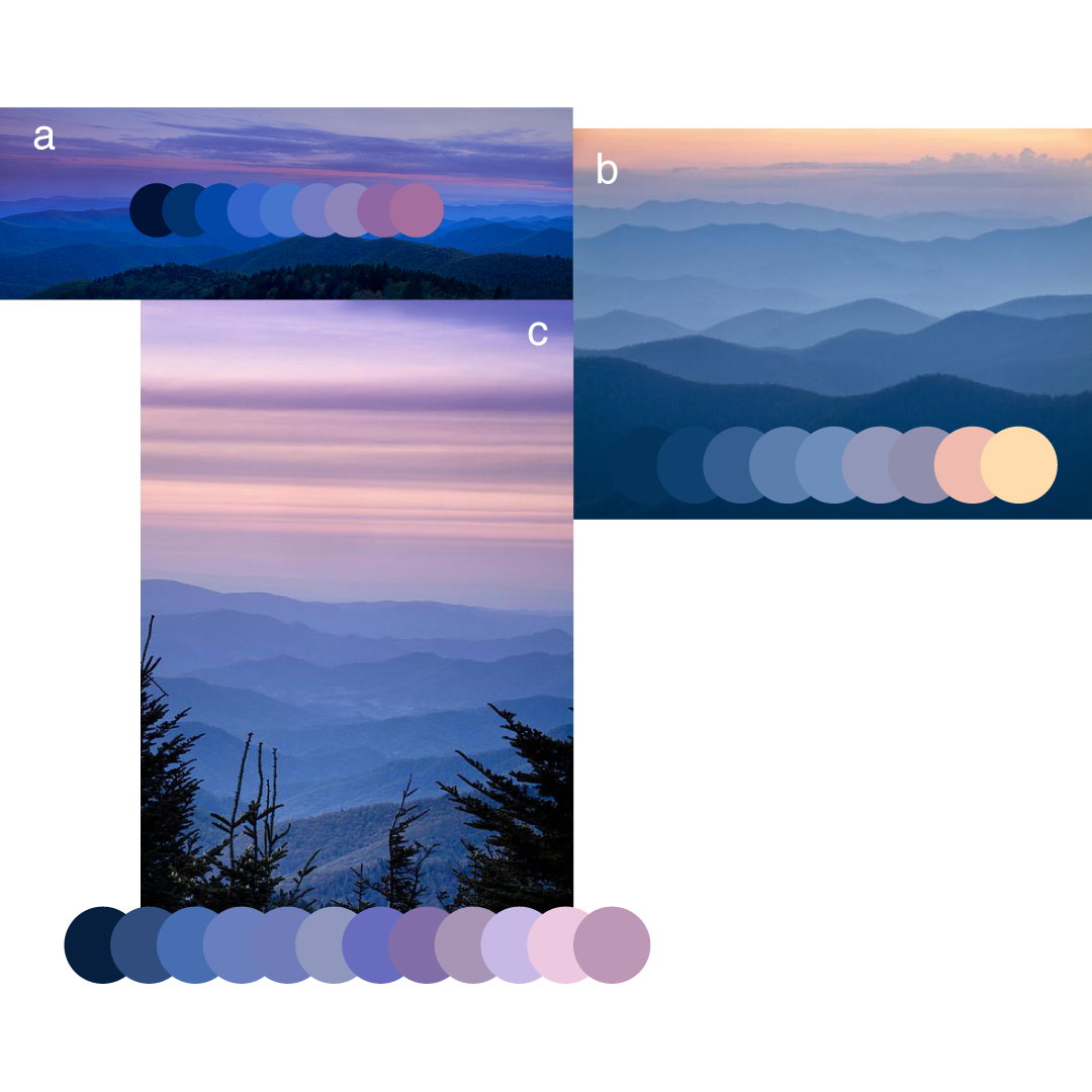
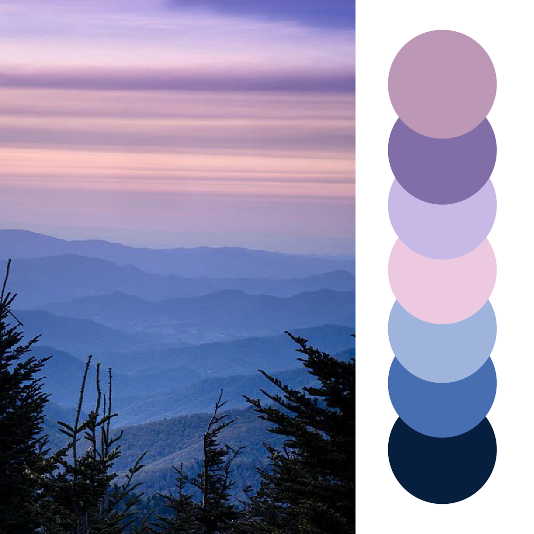
I started with a few basic questions about her aesthetic message and prompted the client to do a little bit of research into logo designs on their own. The client wanted an abstract nature design over text. For colors: blues and purples; colors of the Blue Ridge Mountains at dusk.
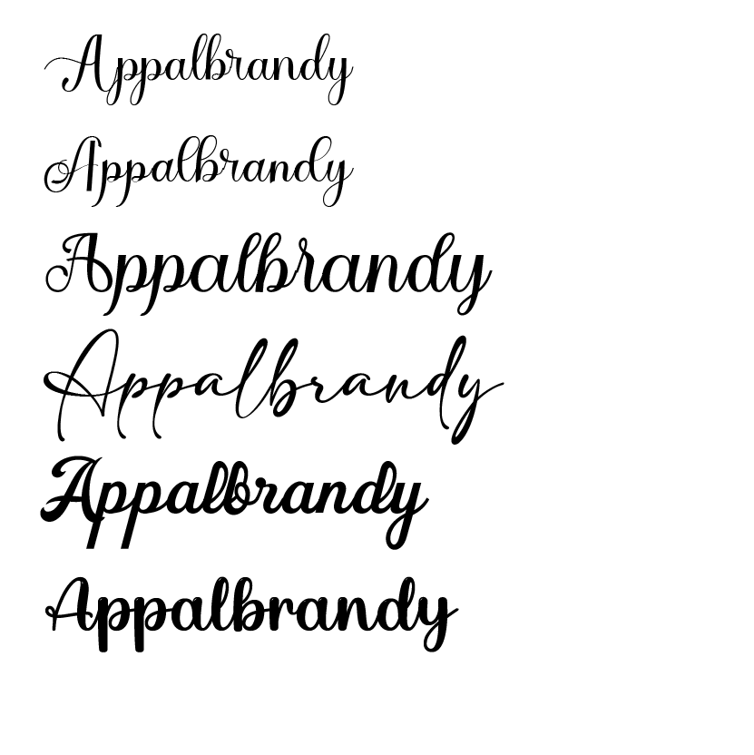
I offered a variety of font and color choices for the client to choose from. Through another process of elimination, we narrowed it down to one color scheme. We used this color scheme across the site to tie everything together.
Project Conclusion: August 5, 2021
We wrapped up our project with a quick in-person Squarespace tutorial to keep her SEO working hard for her as the site continues to grow.
I followed up with the client a couple times after publishing her site to make sure her she’s showing up on search engines.
Reflections
This client’s site is now showing up first every time you search for her.
With only a super-simple logo, a few stock photos, and images the client provided, we were able to create a robust, beautiful and professional site for a local author with a wide variety of content.
The website attracts a regular number of monthly readers, most of which spend a considerable amount of time on the site reading other posts.
