Expectations
Not to be dramatic or anything… but this is my dream project.
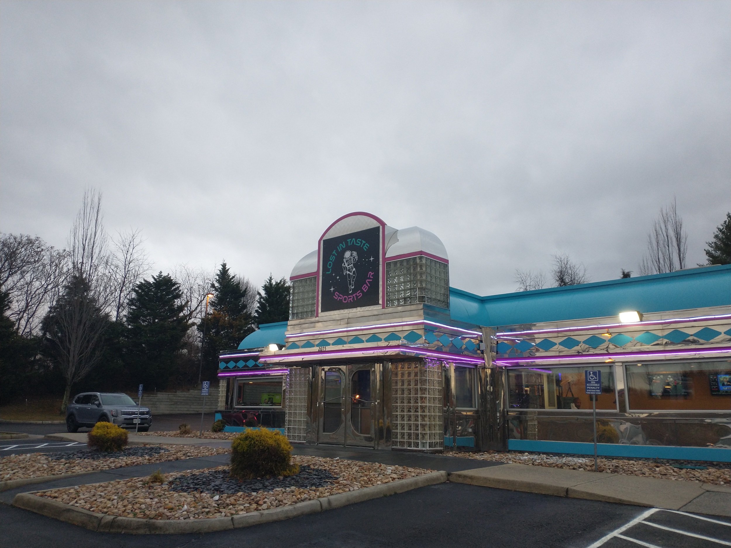
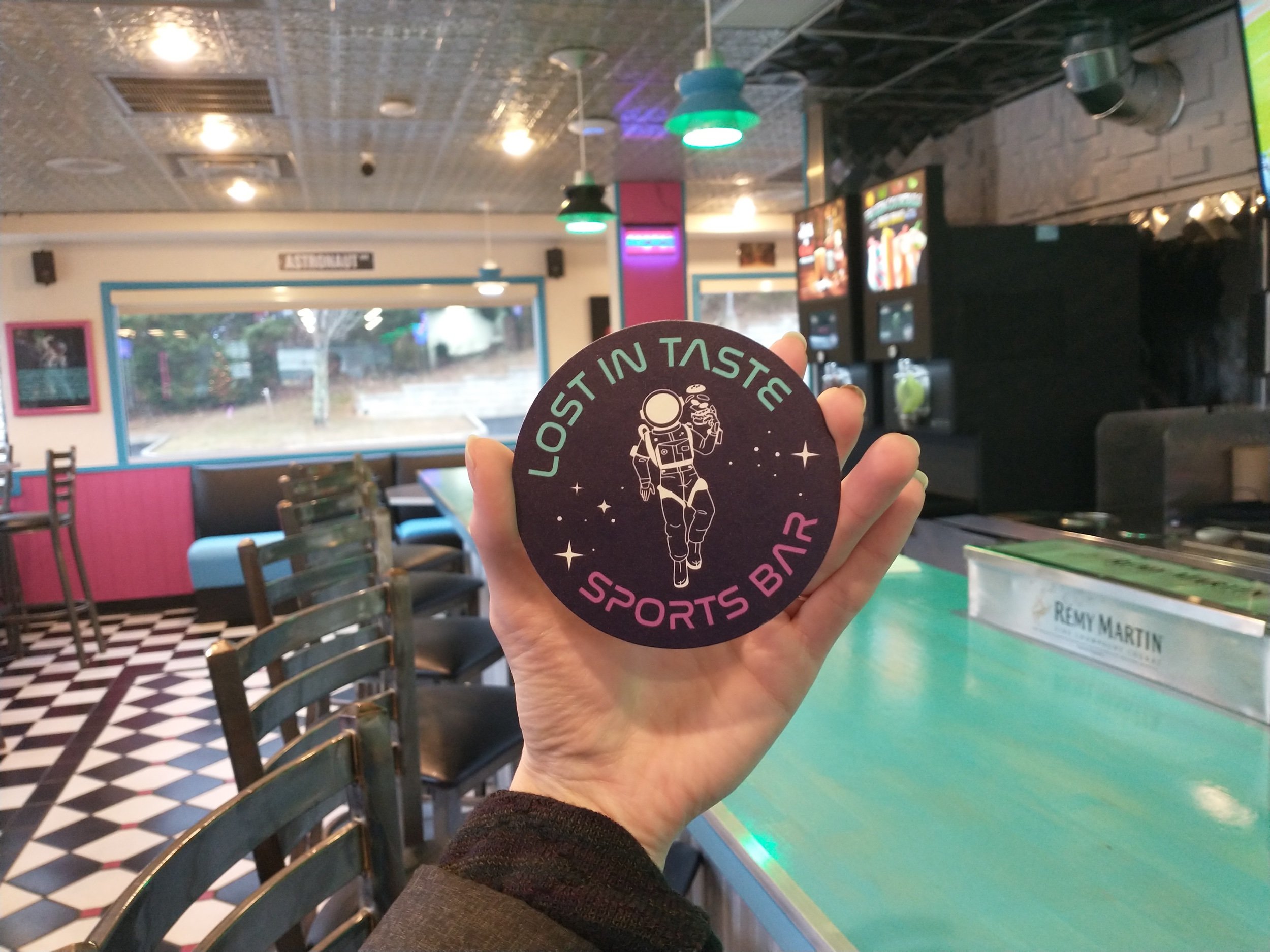
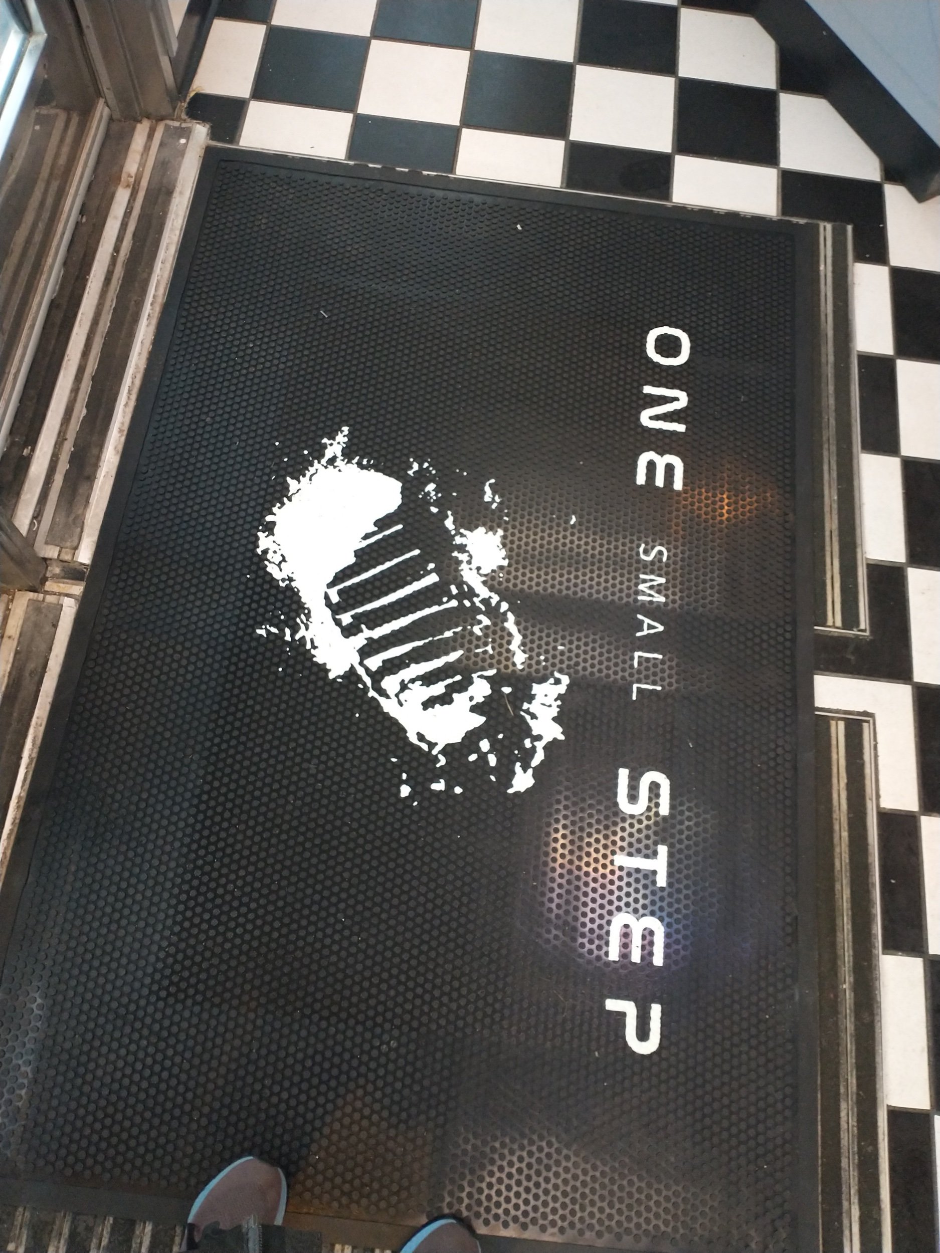
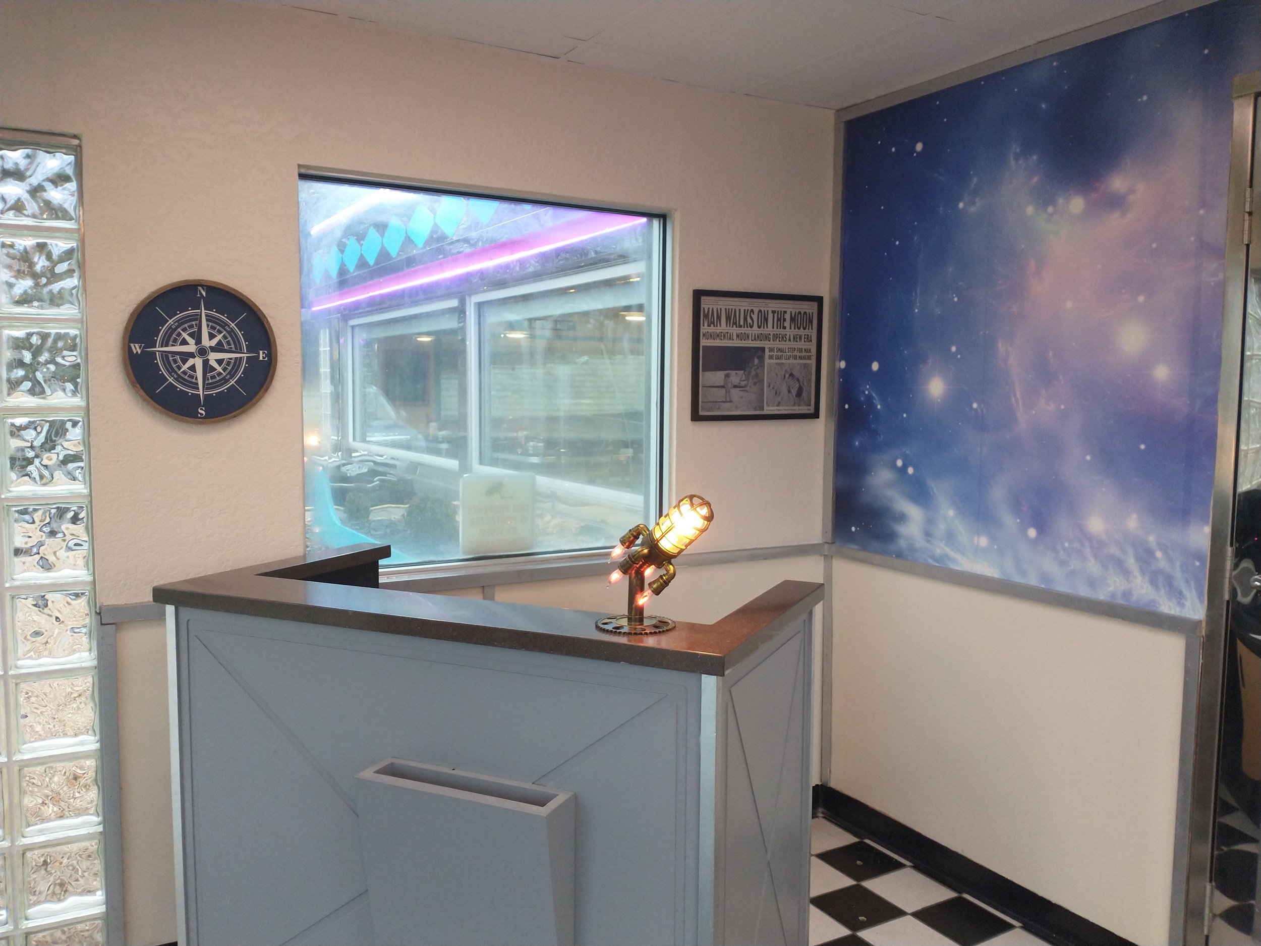
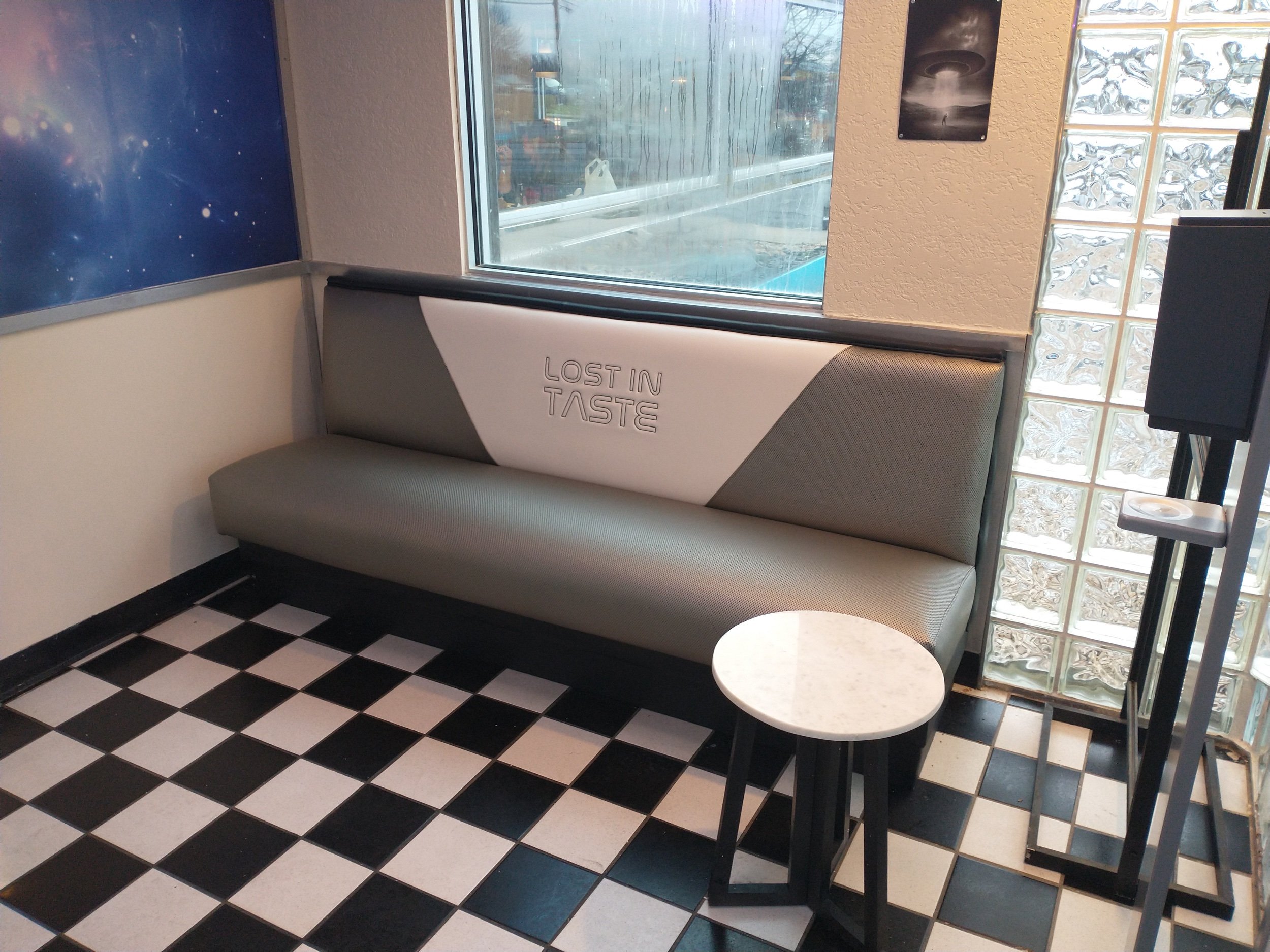
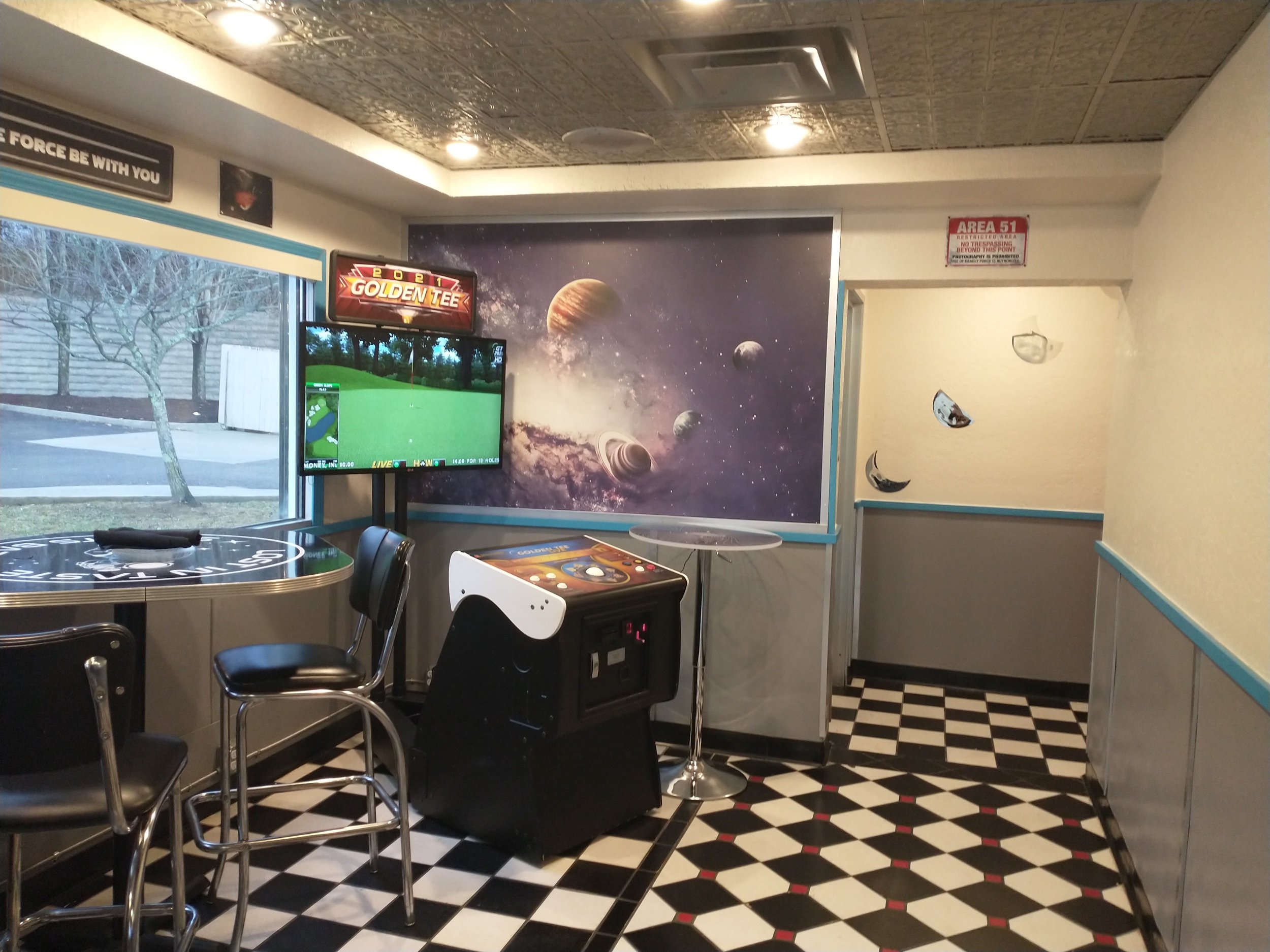
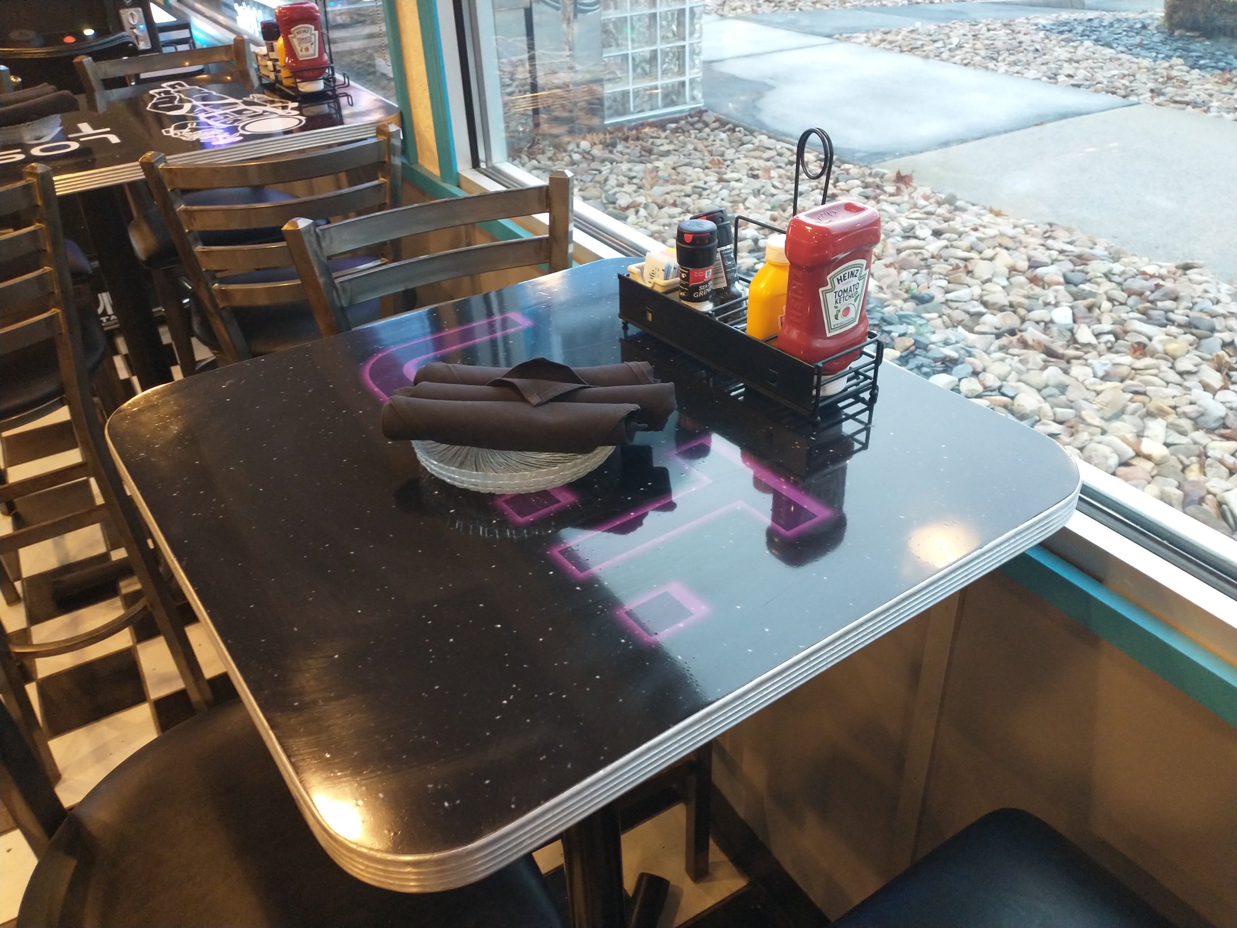
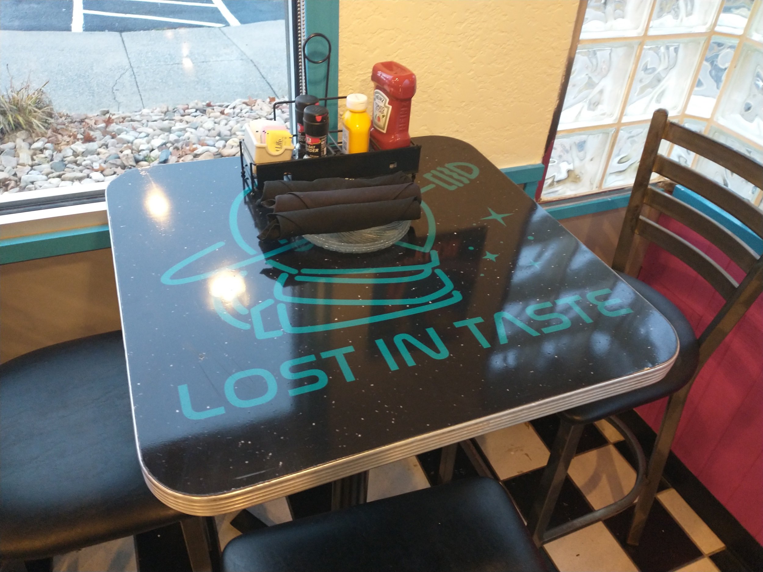
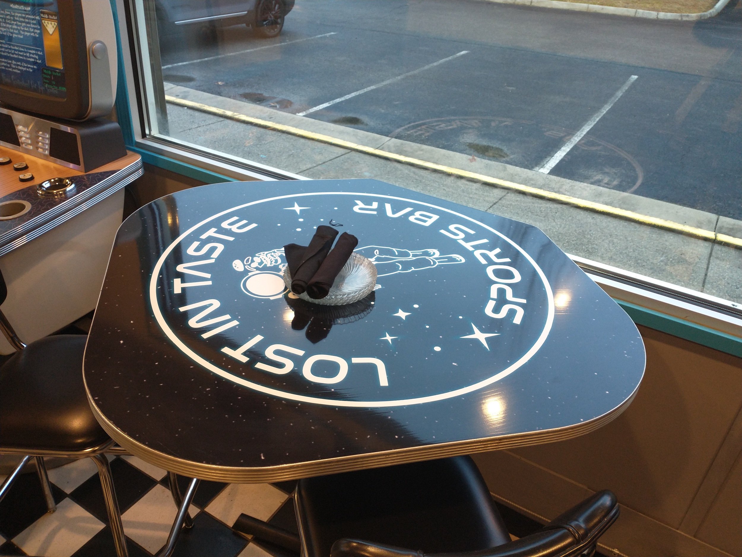
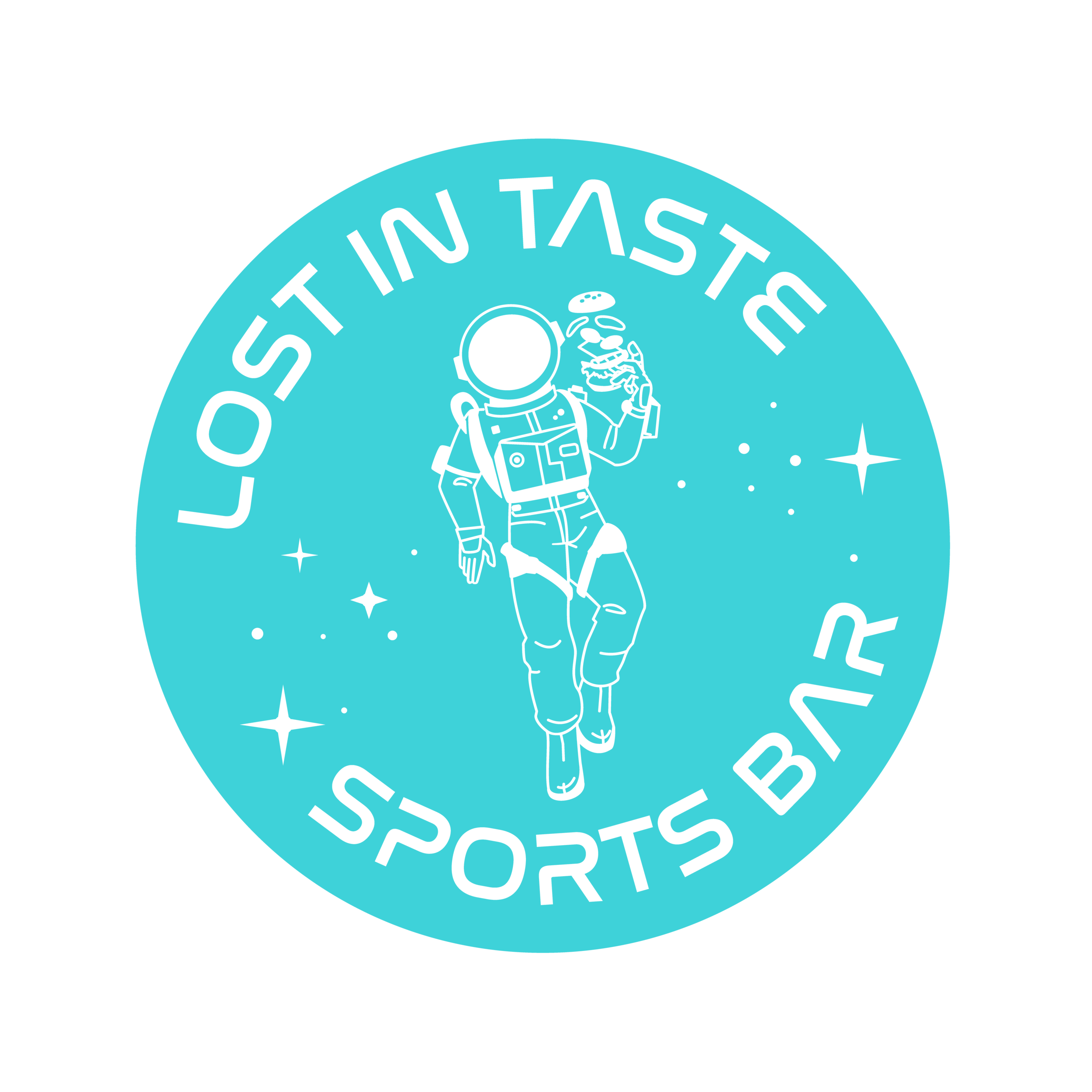
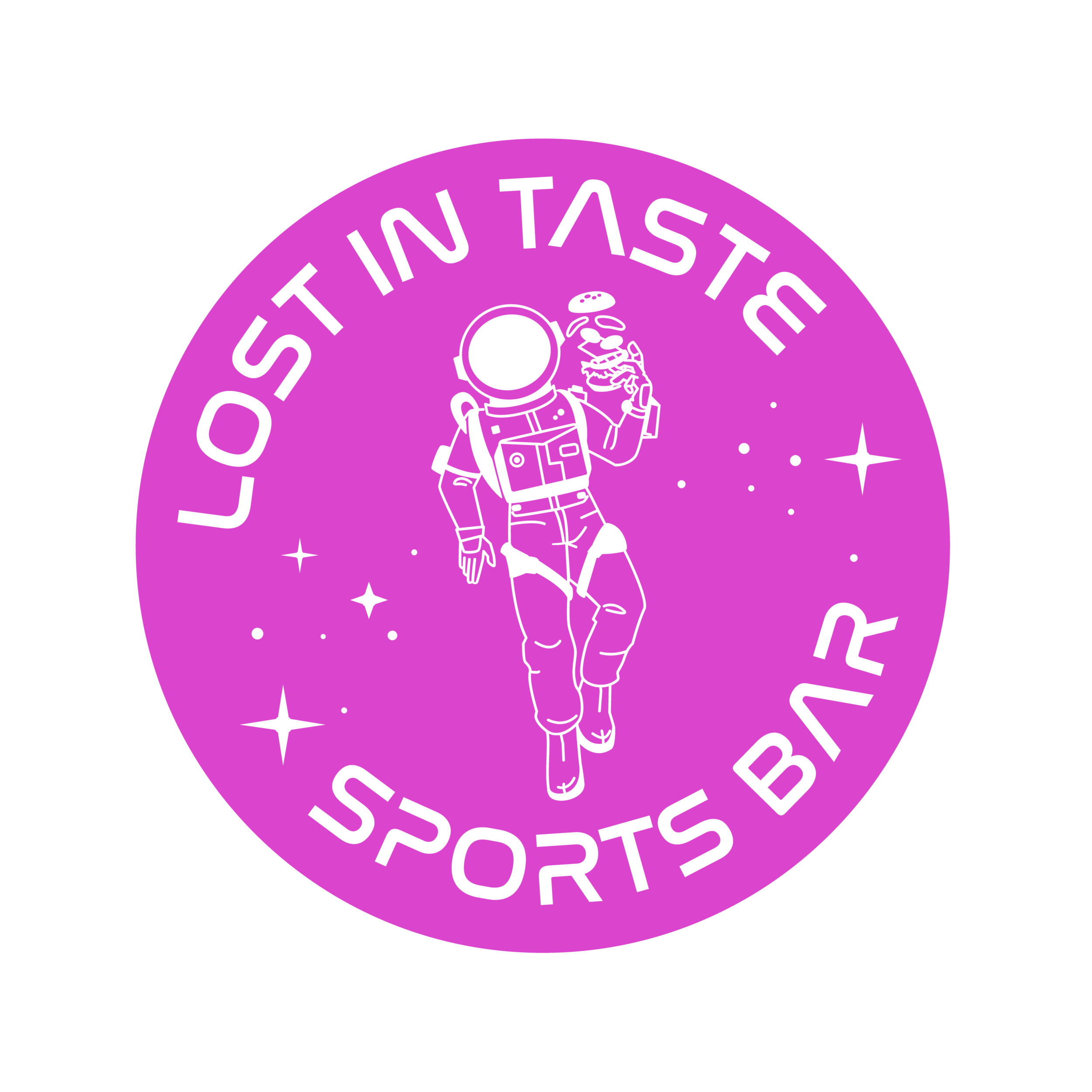
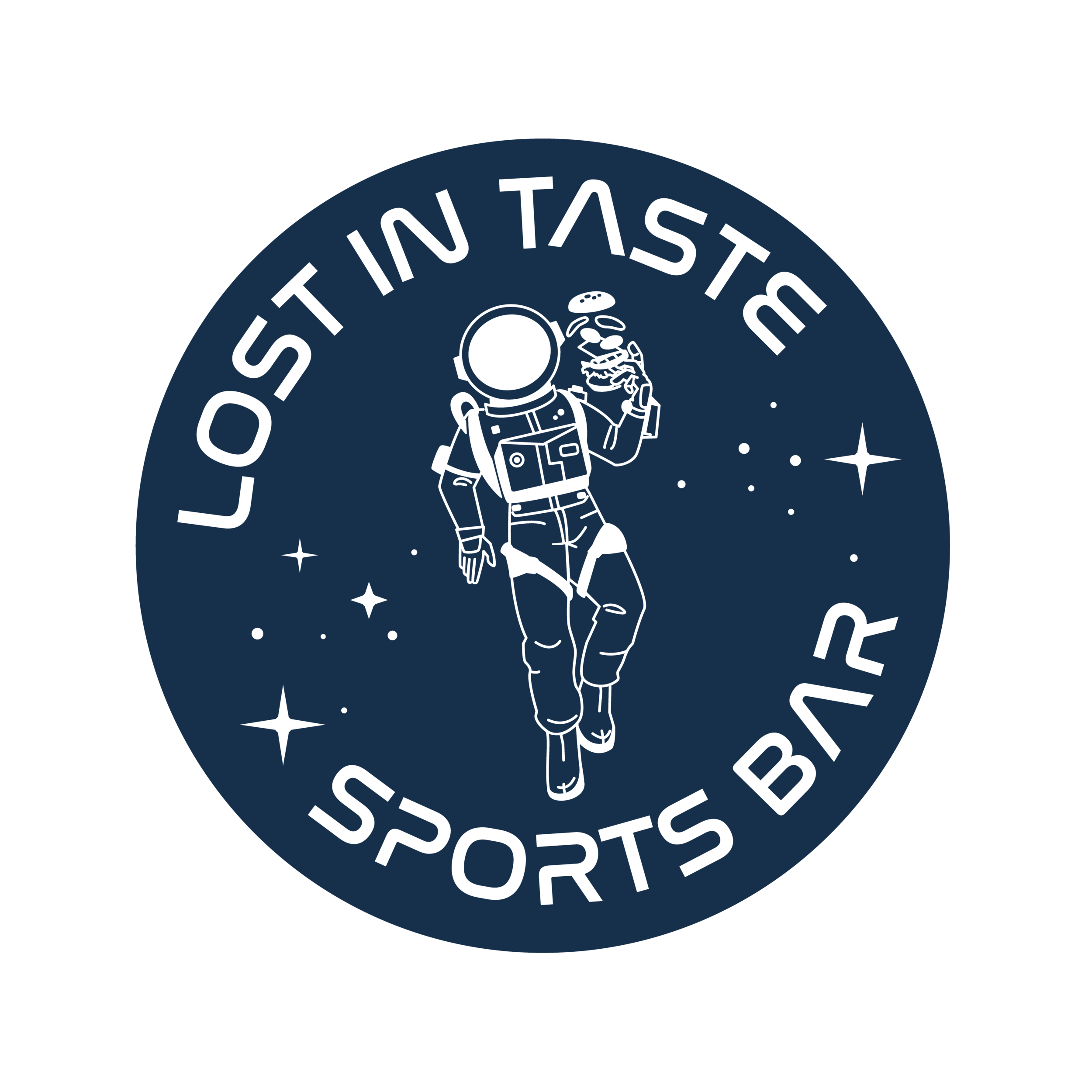
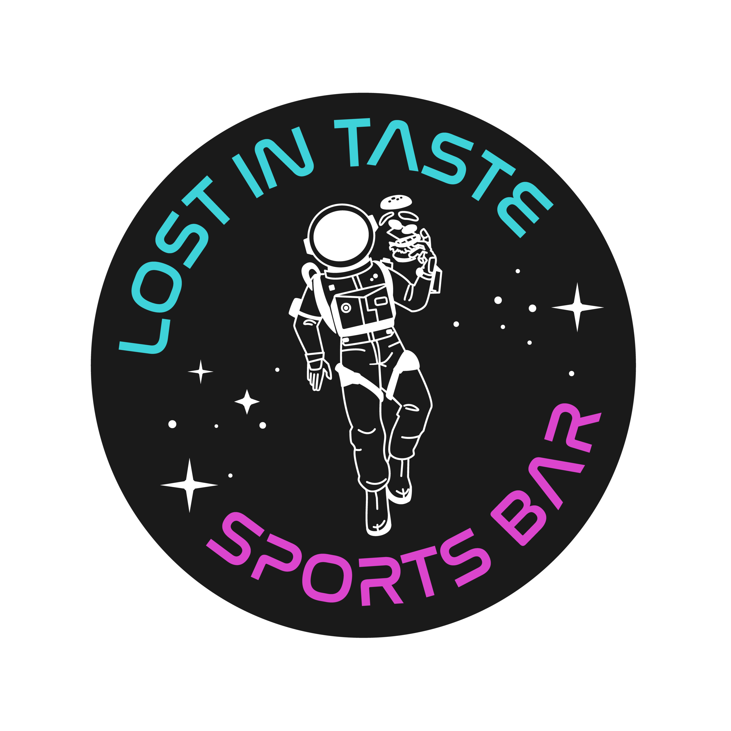
This client came to me for an 80’s/retro/vaporwave style logo design for a space-themed sports bar in Christiansburg, Virginia right down the road from my CBD store.
Not only is this aesthetic is one of my all-time favorites to work with, but the owner also has creative ideas for fleshing out the brand in the near future through story-lines/characters and high-quality branded merchandise. I’m really excited to be a part of this.
So far we’ve completed the logo and brand design. I assisted with color selections for the outside of the building. Soon we will start designing menus, a website and other marketing materials.
UPDATE: Since we completed this project, we have also designed a Squarespace website for Lost In Taste.
Process & Results
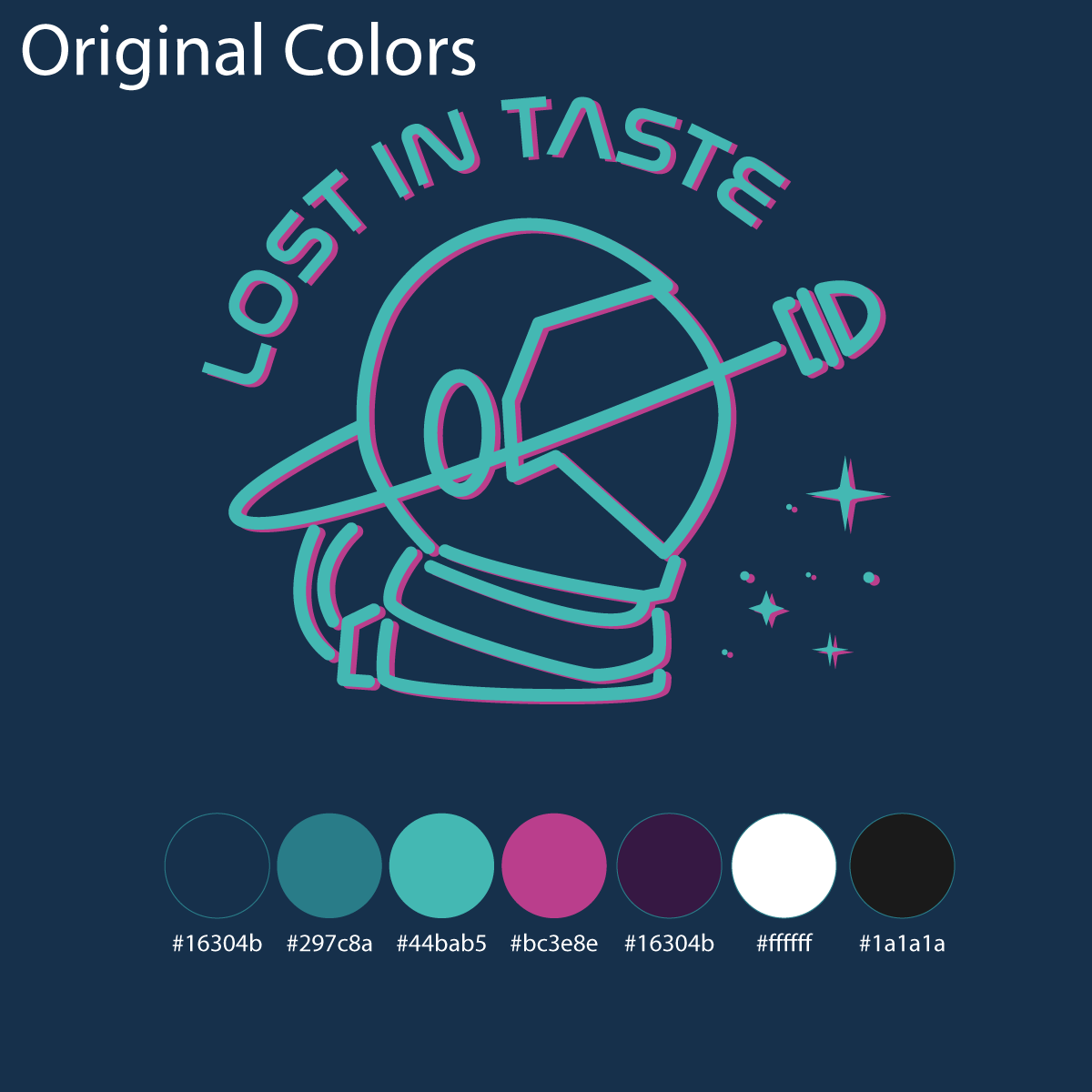
Fonts, colors and inspiration
The client came prepared with a font and a general color scheme. For good measure, I experimented with some other similar fonts. But the client’s original font ended up being “the one”.
We started with a Pinterest board of inspiration. We went back and forth and narrowed down ideas. Then, I passed on instructions and inspirations/references to my illustrator (Berkeley).
Illustration
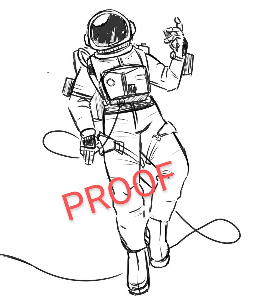
Berkeley and I spent a few days going back and forth. Berkeley is skilled with anatomically accurate drawings and greatly values the details. I kept requesting she remove more detail and simplify further, but there was only so far she was willing to go. This is exactly what I needed from her though, and an example of how our talents balance each other out.
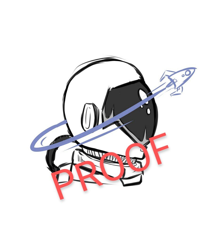
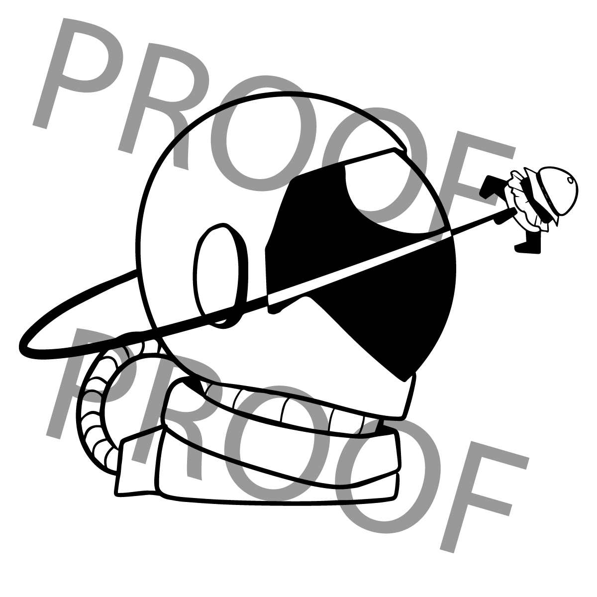
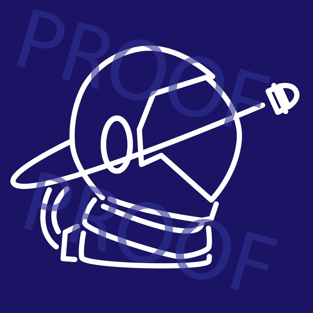
My next step was to convert her illustration into a simpler, uniform outline reminiscent of neon lights. During this step, I was singing Berkeley’s praises extra loud, as the details that remained after our compromises were exactly what the illustration needed to look complete with as few strokes as possible.
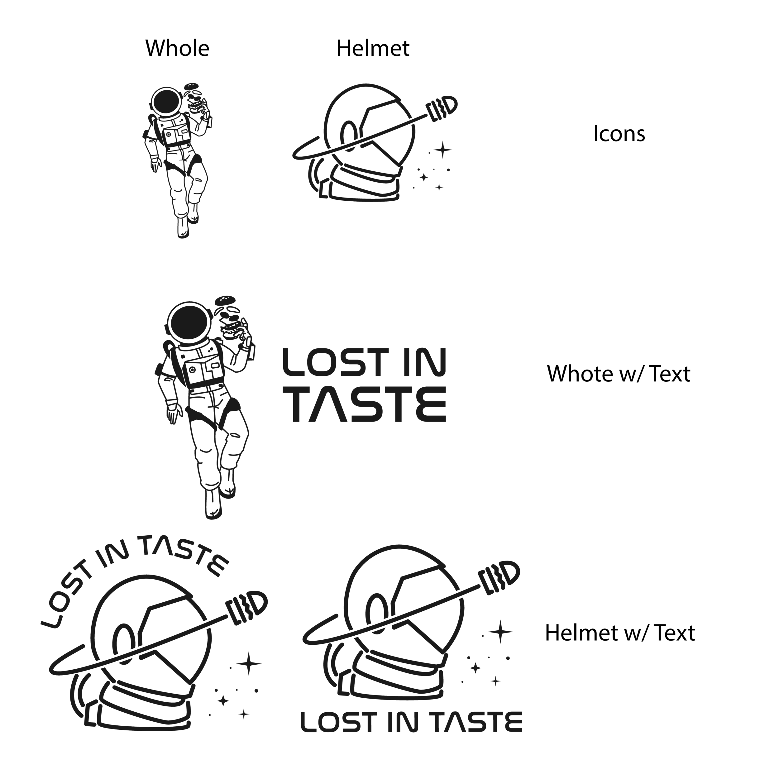
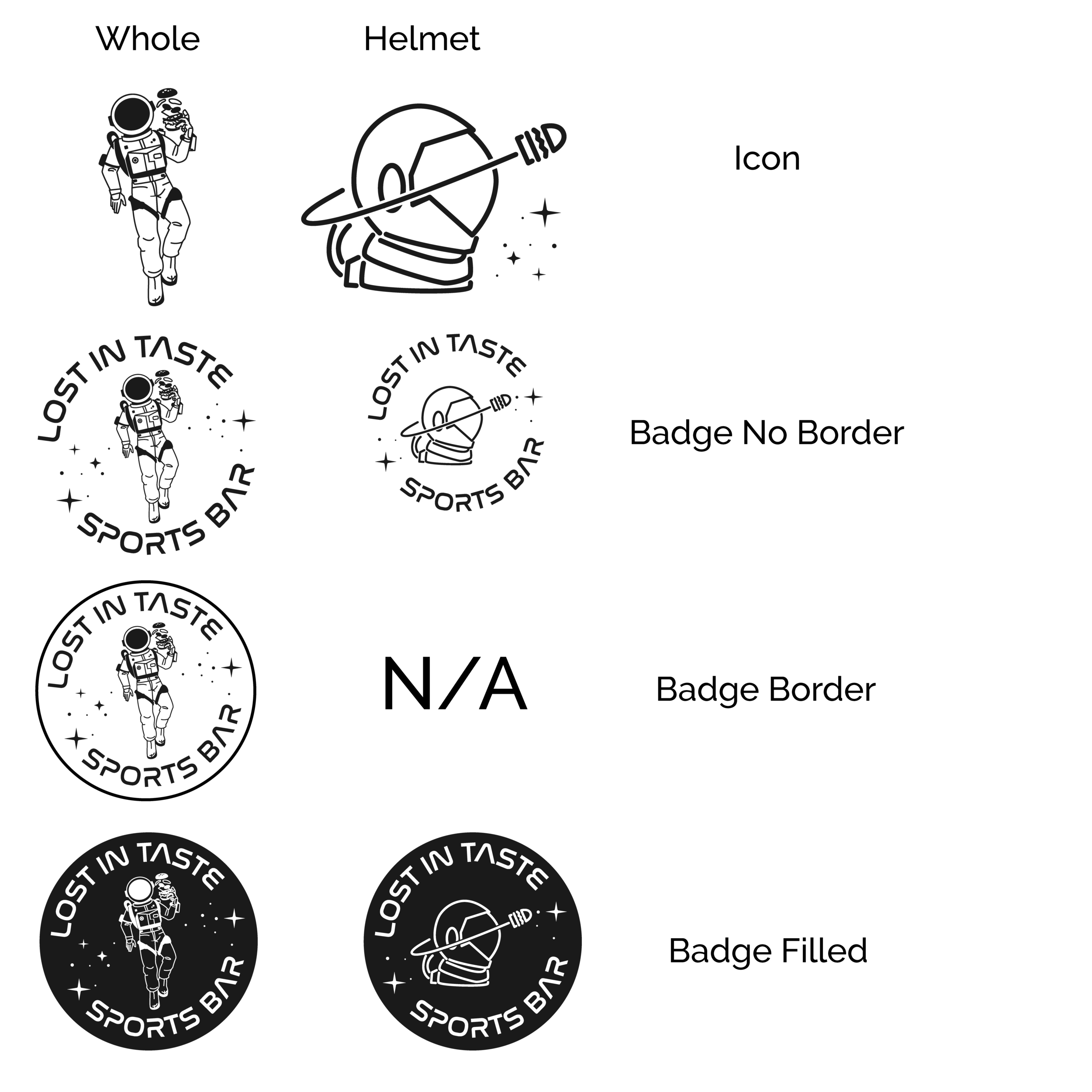
Variations Galore!
The client wanted to have a fairly realistic and detailed logo; they were very attached to the idea of the full-body astronaut as part of the design. I also love this concept. However, in order to set the client up for future logo needs, I insisted that we include a simpler icon design using just the astronauts head. The reason for this is that logos must look good when viewed both up close as well as when printed very, very small. This is called the “Piccolino Test”; “Keeping your logo’s letters or icon legible at all sizes is an art form. Your logo design needs to be effective everywhere, including the piccolino logo—in print, digital, embroidery, silk screening, and more.” (Lou Leonardis, Trillion Creative) Since I don’t think the full-body astronaut version will look its best printed at the smallest sizes, I provided helmet-only versions that WILL look good printed at small sizes. The client can use any of these variations interchangeably and all of them will still be uniquely recognizable as THEIR brand.
Now, this many variations of a logo is not the right decision for all brands, but it WAS the right decision for this one. I’m not in the business of forcing design principles on people; I’m in the business of making clients happy. Compromises made between designer and client are part of the process.
At first the client was not sure about my insistence on including the extra versions, but once they saw the project come together, they were grateful that it was included.
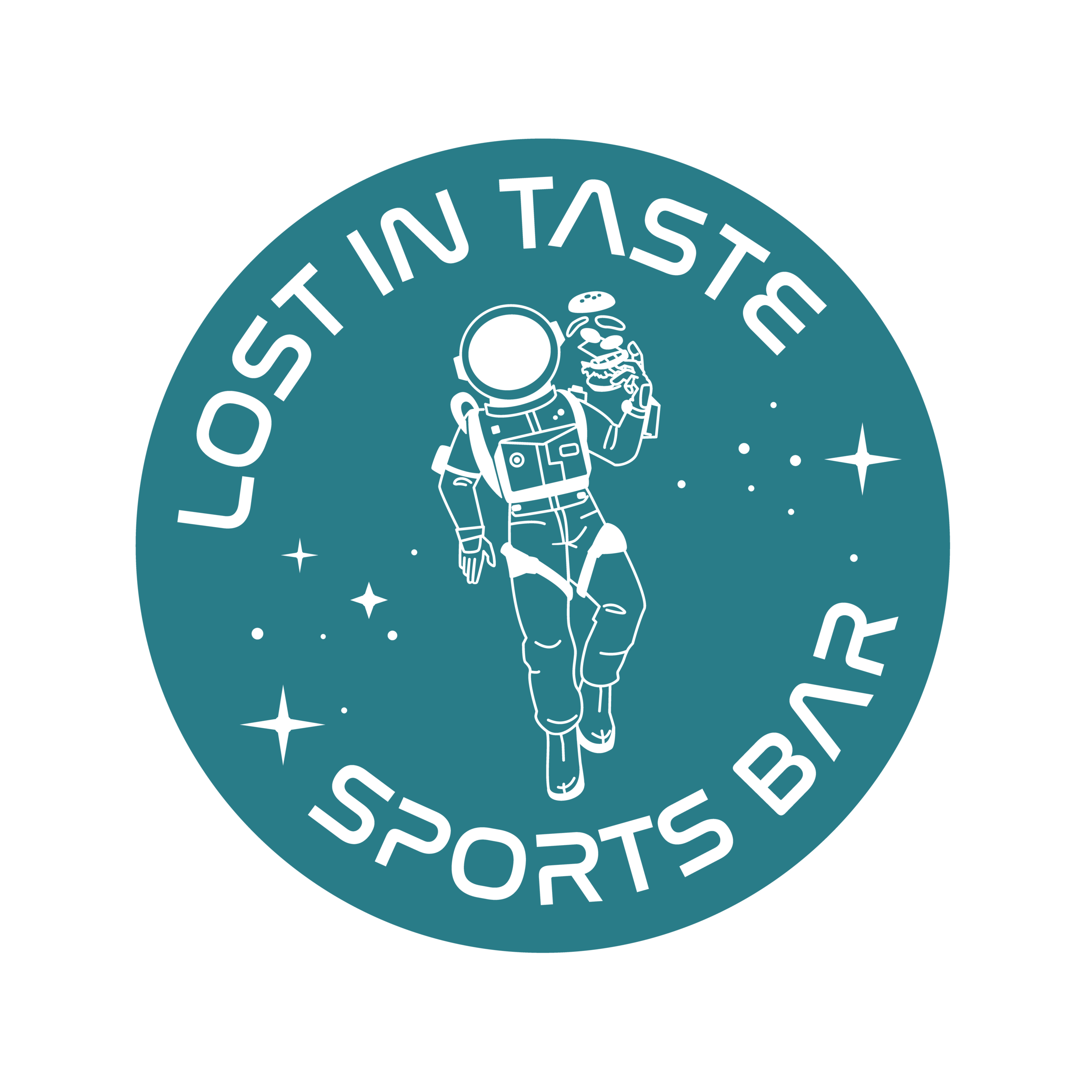
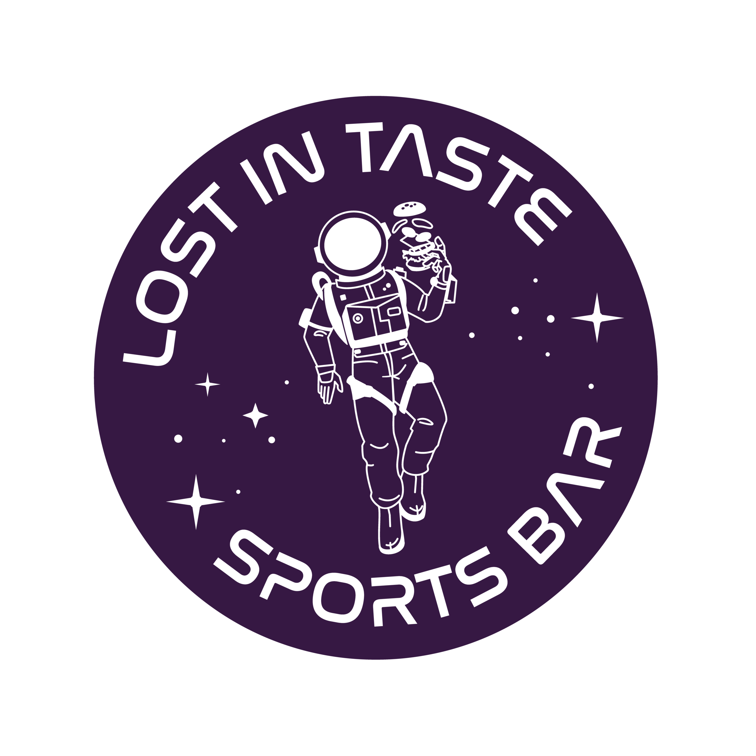
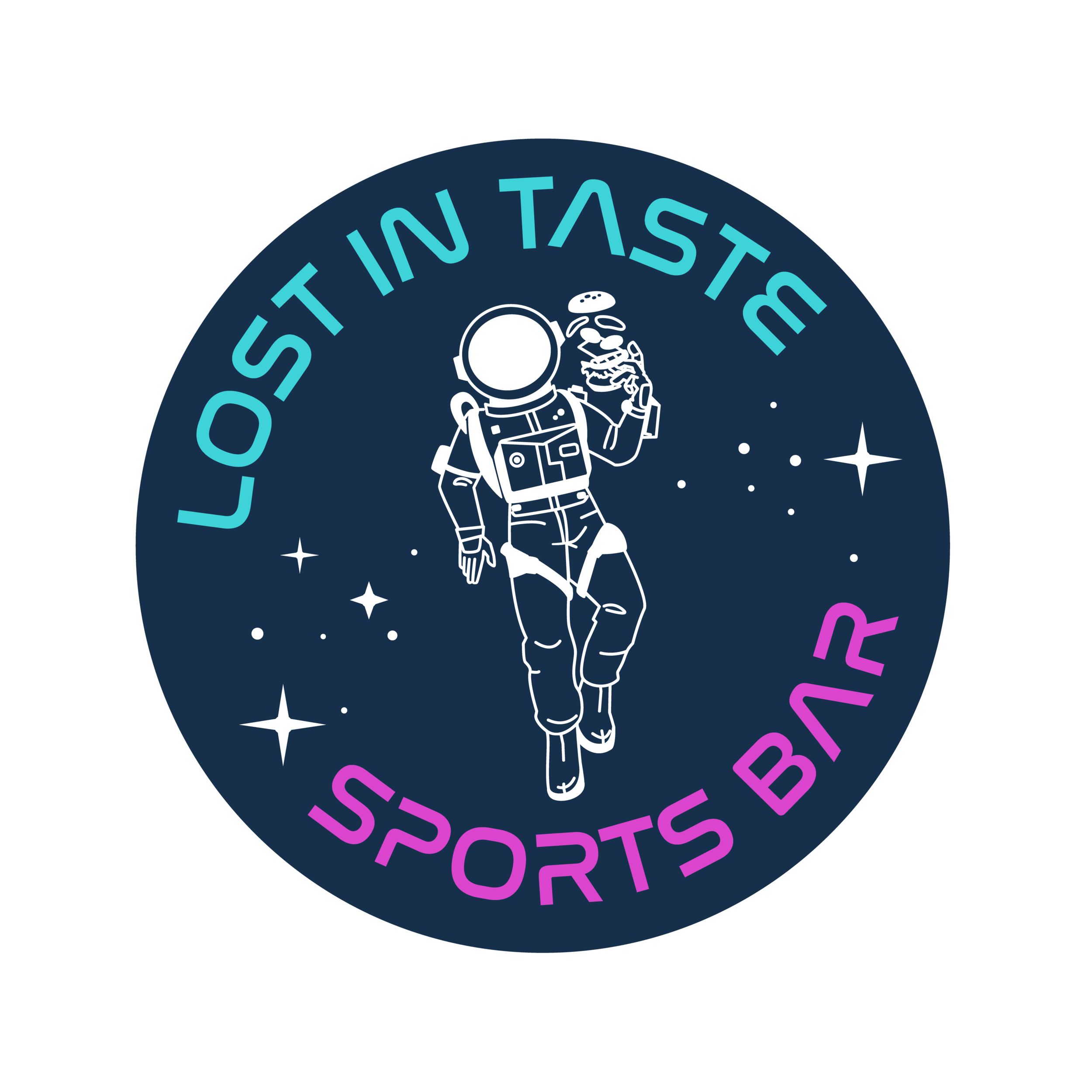
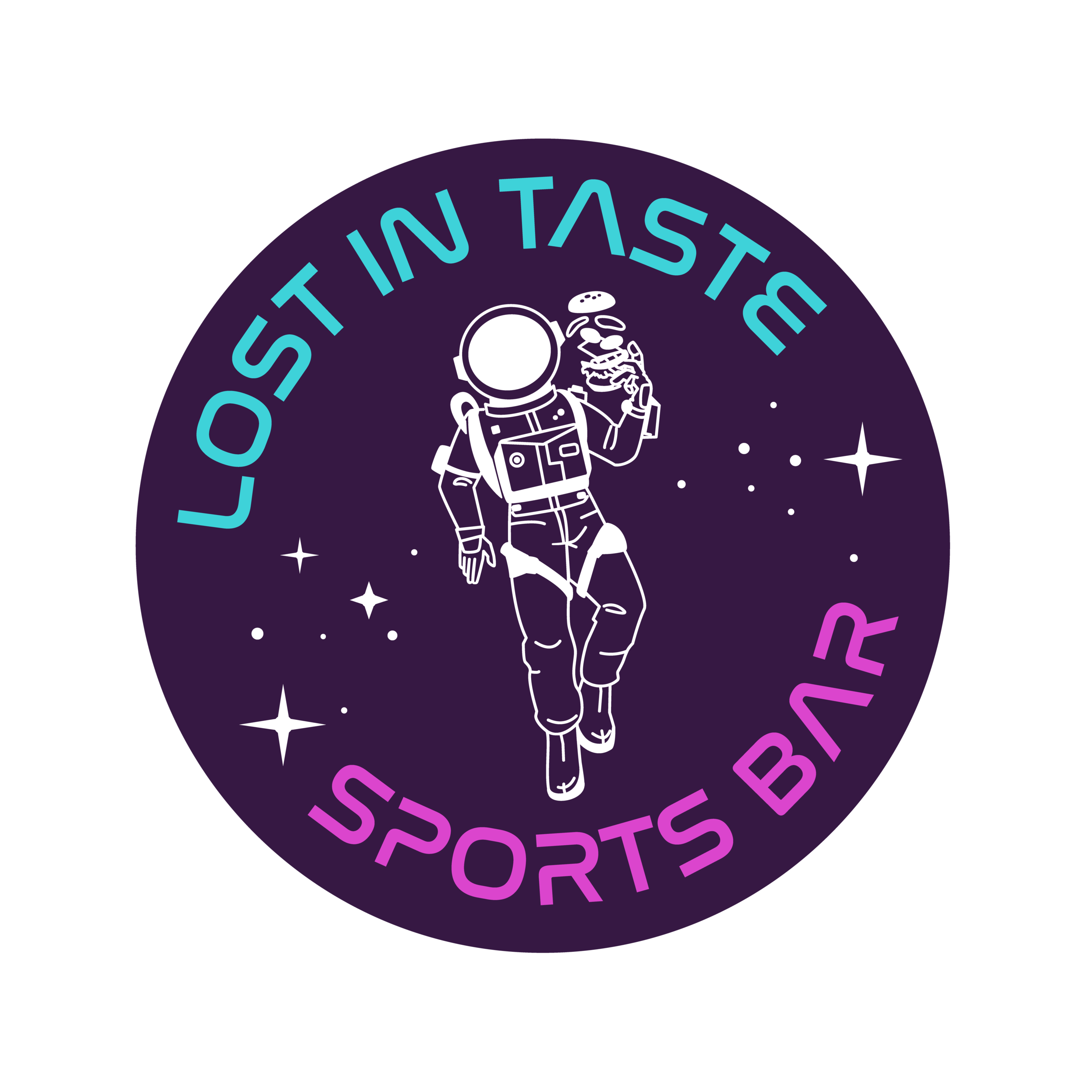
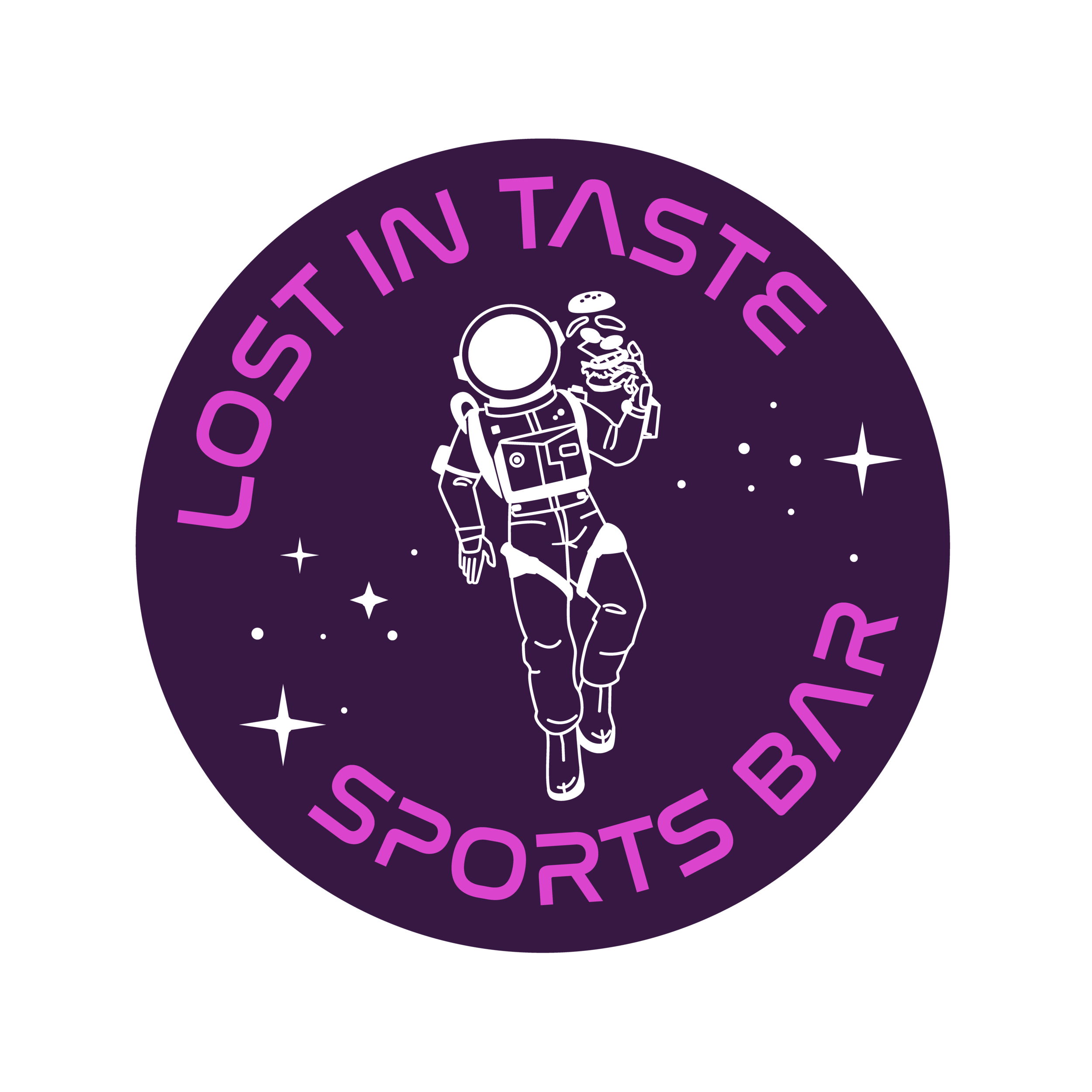
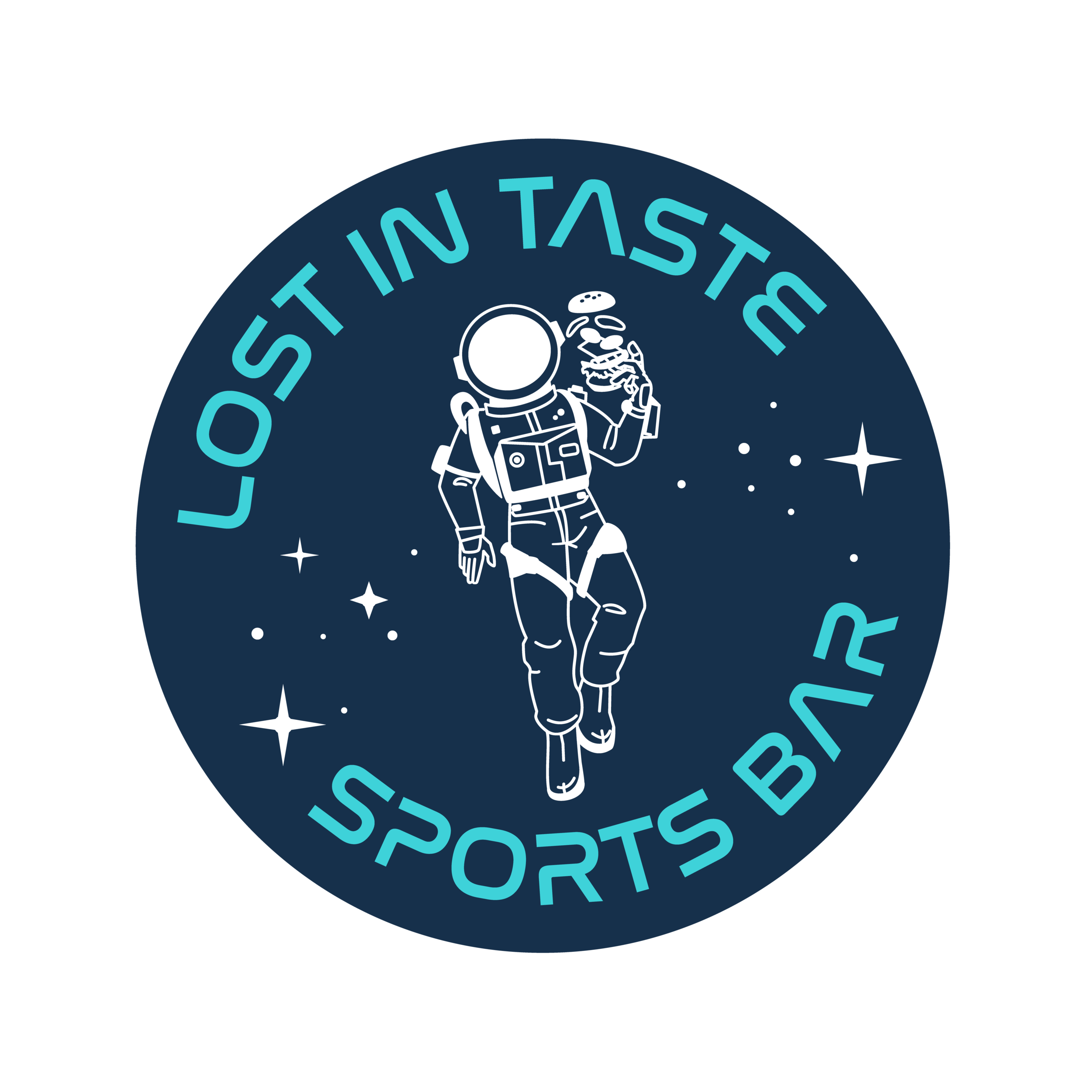
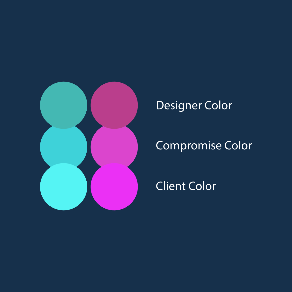
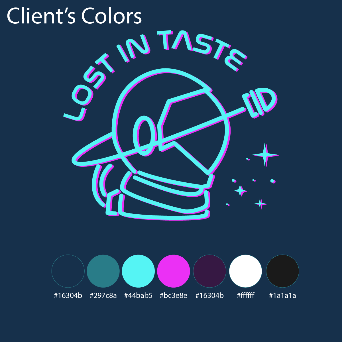
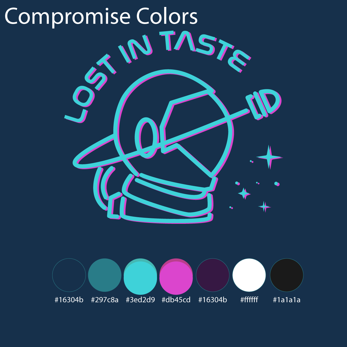
Color compromises
Another area in which compromises were made were colors. Although the basic colors were already chosen for me, I was responsible for choosing the specific shades. The client definitely wanted bright neon cyan and bright magenta as part of the color scheme. I brought the RGB/CMYK sliders down juuust a little bit from pure magenta and pure cyan so that this logo will contrast well on black and white backgrounds without hurting your eyes. I demonstrated the reason for this detail by giving the client plentiful examples of different variations on the color scheme throughout the design process.
Client feedback / perfect proportions
One of the most eye-opening and mind-blowing requests I got back from the client was to make the head of the astronaut bigger.
At first I’m like: “Oh geez… this is going to be a pain.” But I was wrong! After kinda side-eyeing this illustration with disdain for a bit while bouncing between other tasks at my shop (I’m NOT a linear worker!), I returned inspired.
I grouped different pieces of the astronaut’s body together (arms, torso, legs, head) and started by downsizing the body, leaving the head where it was. I adjusted the limbs as well, shifted things around by a few pixels, and compared a few different takes.
I was extremely satisfied with the result. This is a great example of a time a client suggested something I honestly wouldn’t have thought of myself and 100% hit the nail on the head. Honesty and openness on both sides is crucial.
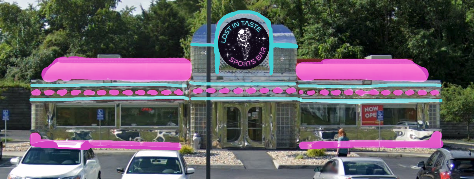
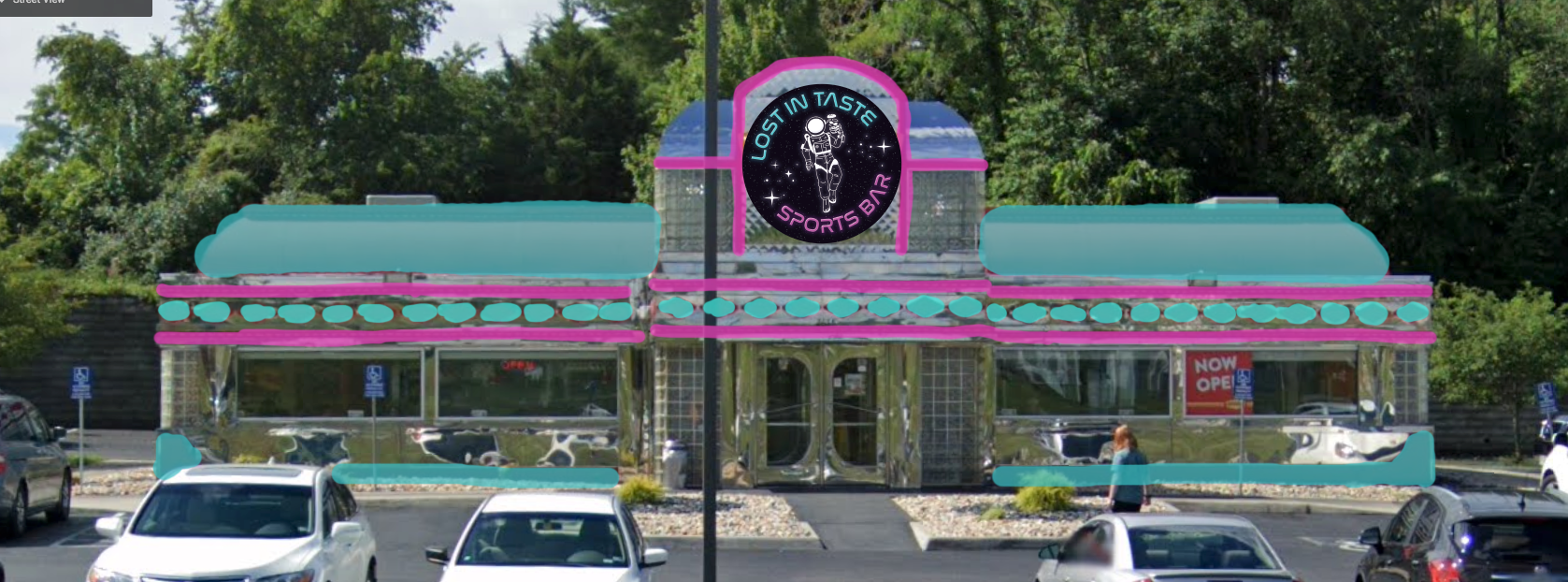
Outdoor painting plans
I assisted with color choices for the outside of the restaurant by whipping up some super quick and sloppy Photoshop edits. These are so bad they’re kind of embarrassing, but it accomplished its purpose… the building painting will be complete soon, so I’ll share an after photo later!
Conclusion
My design process is all about balance; Balancing and managing my time throughout each step, balancing the client’s creative desires and my own, balancing tried-and-true design principles while also challenging the status quo. Each client has a vision of what their logo could be, and it’s my job to extract those ideas, interpret them, and make them come to life.
Although the branding for this project is finished, the restaurant has yet to open, so I’m having trouble articulating my resolution. I’ll save my final thoughts on how this project came together and how we were able to meet this client’s expectations until the other accompanying marketing materials have been completed and I’ve had the chance to observe results.
To be continued…